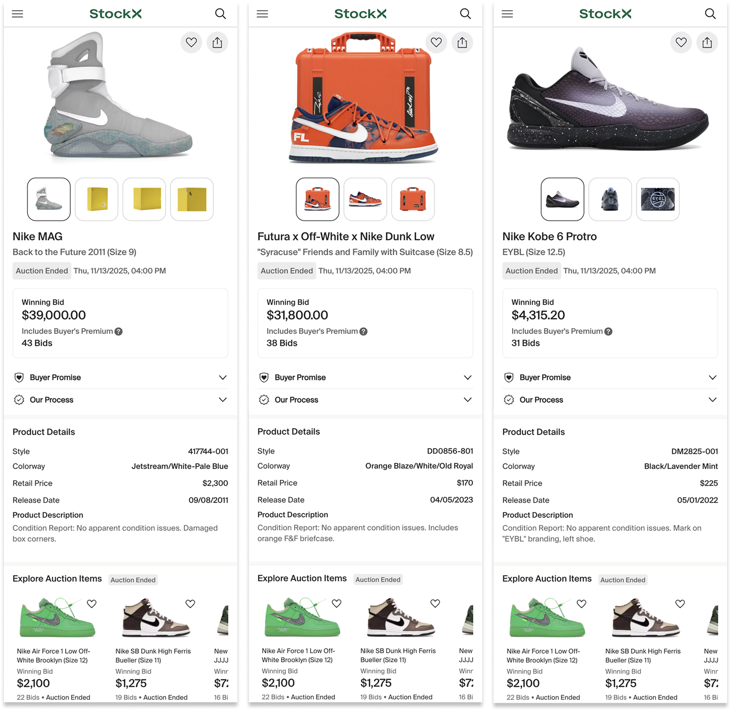
StockX Auctions
Allowing Enthusiasts to Bid on Rare and Unique Offerings
StockX | Lead UX/UI Design, Research | 2025
The Opportunity
High-end auctions thrived in our categories, and we saw an opportunity to disrupt current auction houses.
Trading cards, rare sneakers, and hype brand collectibles perform very well through auction models
Emerging startups were focusing on auction models
Auction houses’ aging demographic was ripe for disruption
It’s a Journey
Auctions aren’t just transactions; they’re live events. We broke the process into three distinct acts: Before, During, and After. Each stage has its own rhythm, stakes, and stories to tell.
User Personas:
The Spectators: passive watchers researching items and prices whose goal is to understand the system and get excited to return and share in milestone moments.
The Bidders: active participants placing bids whose goal is to bid easily and quickly.
The Winner: whose goal is to relish in their victory.
Research
We researched what makes auctions feel energetic and engaging, from the fast-paced excitement of a live auction house to digital cues like pulsing dots, countdowns, and status indicators that communicate each stage of the auction through to its conclusion.
Lo-Fi Sketches
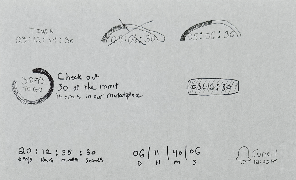
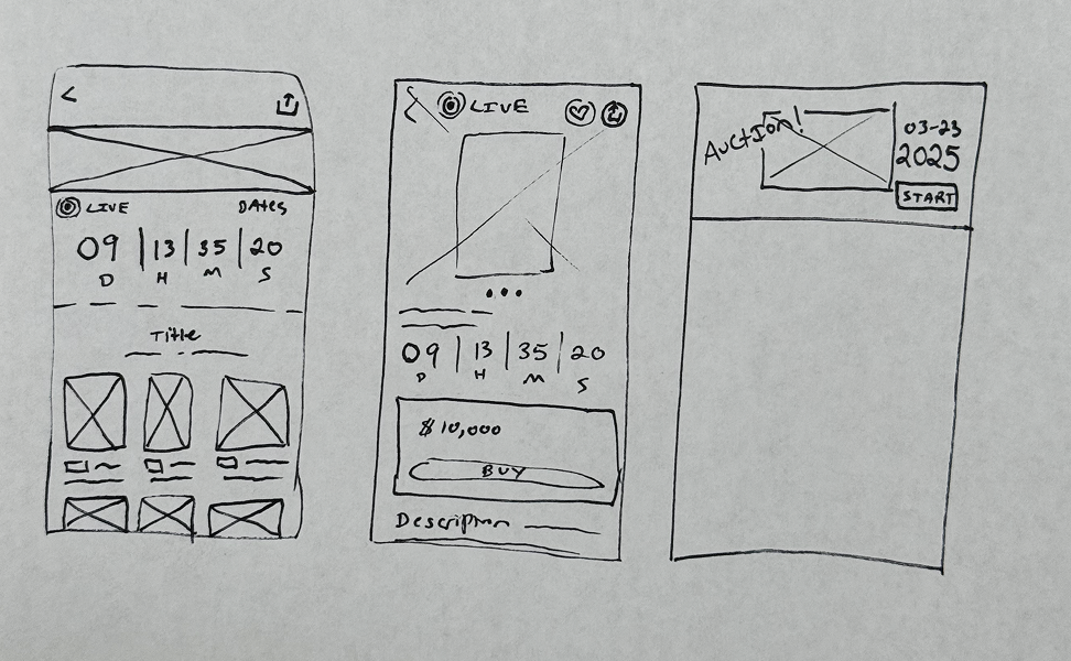
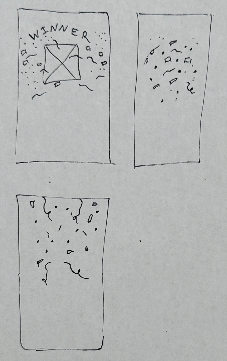
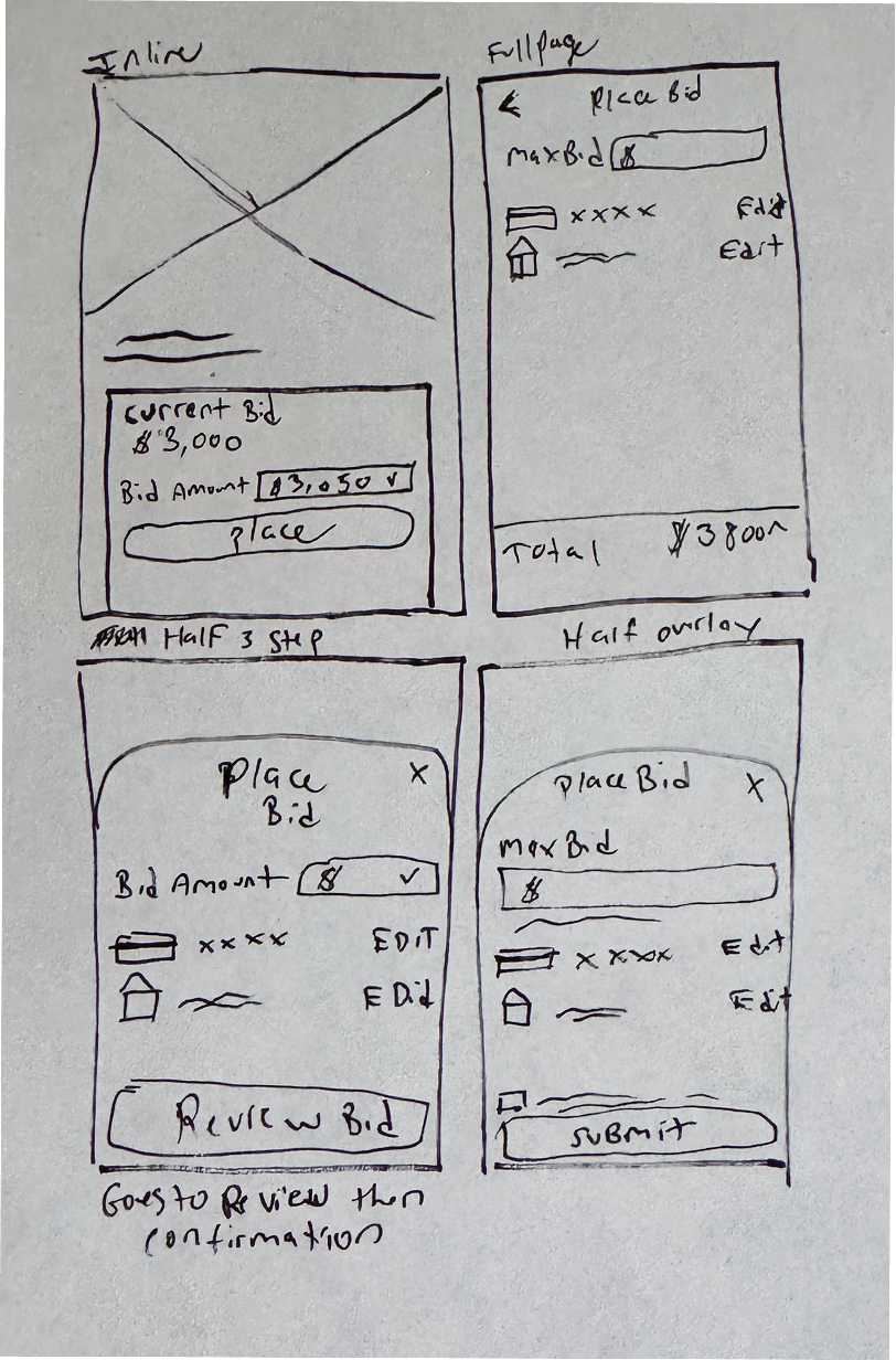
Hand sketches always do the trick when there’s a rush of ideas and so many details to nail down. I explored everything from the timer content, the winning screen, landing page layout, and the product detail page.
The Heart & Soul
I wanted the auction PDPs to have a noticeable differentiation from a standard PDP because they acted differently. During an auction, once a user places a bid, they cannot cancel or lower it. So when you’re bidding on high-priced items, there is a lot more at stake.
I started by exploring options for “During” auction stage, trying out various treatments and content, pulling inspiration from elements like financial tickers and signage.
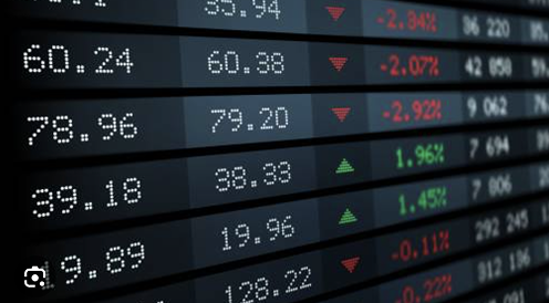
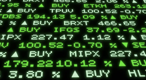
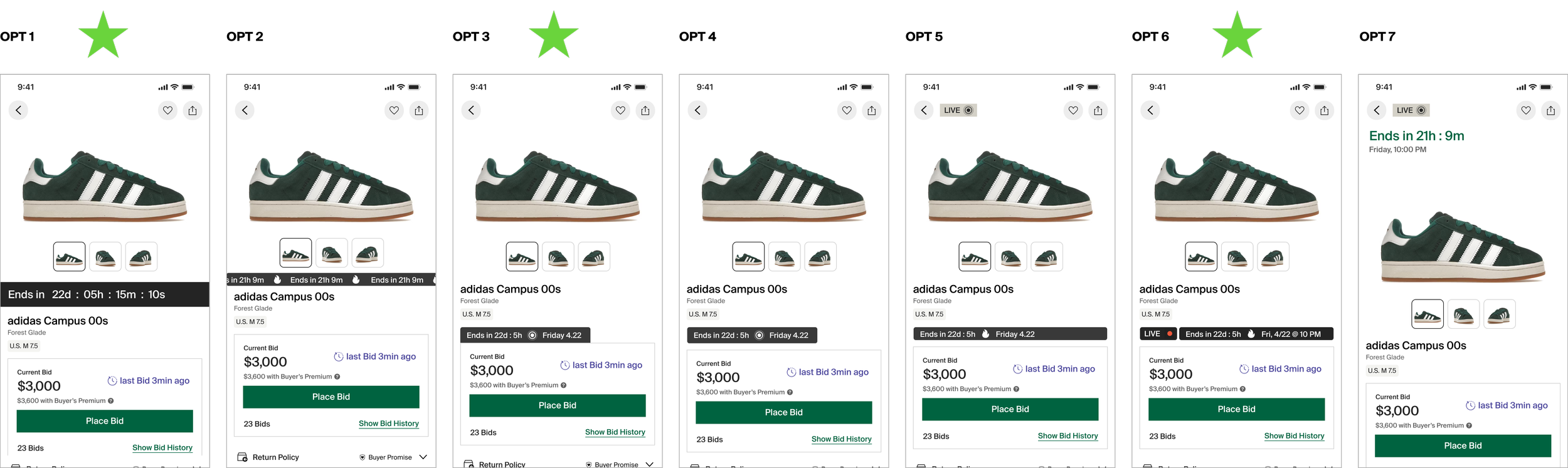
We narrowed down to three favorite concept layouts and expanded to show the other stages in an auction.
The business requested that the full date and time be shown at all times. I tried varying content combinations, but quickly learned that showing all of the information at once wouldn’t work.
Not enough space
Information overload
We tested various information combinations to meet users where they were at each stage of the auction.
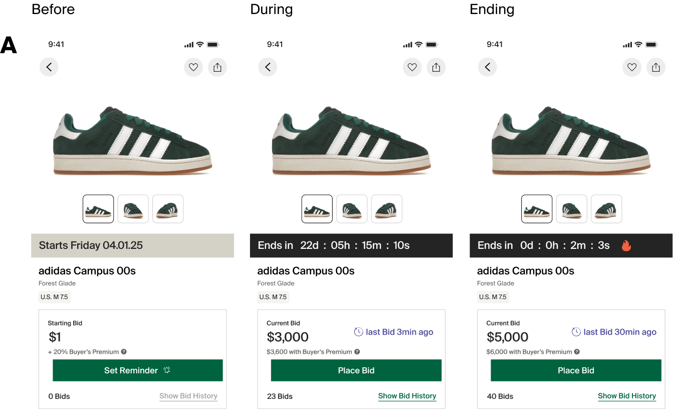
Option A: We liked the idea of an immersive banner that looked alive with an active countdown. But it felt too large and attention-grabbing, so it could take away from the primary page actions.
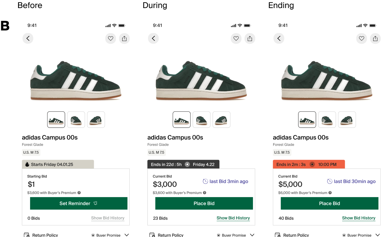
Option B: We tried a more reduced view, but it felt incomplete.
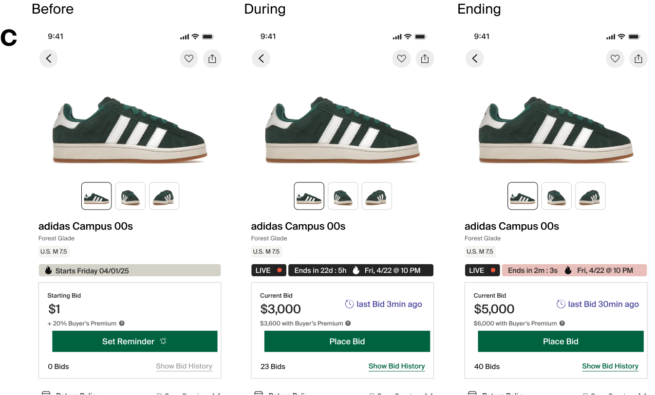
Option C: We matched the height of our tag component, which would give us the option to carry a similar affordance throughout the experience. It also felt like a good middle ground between A & B.
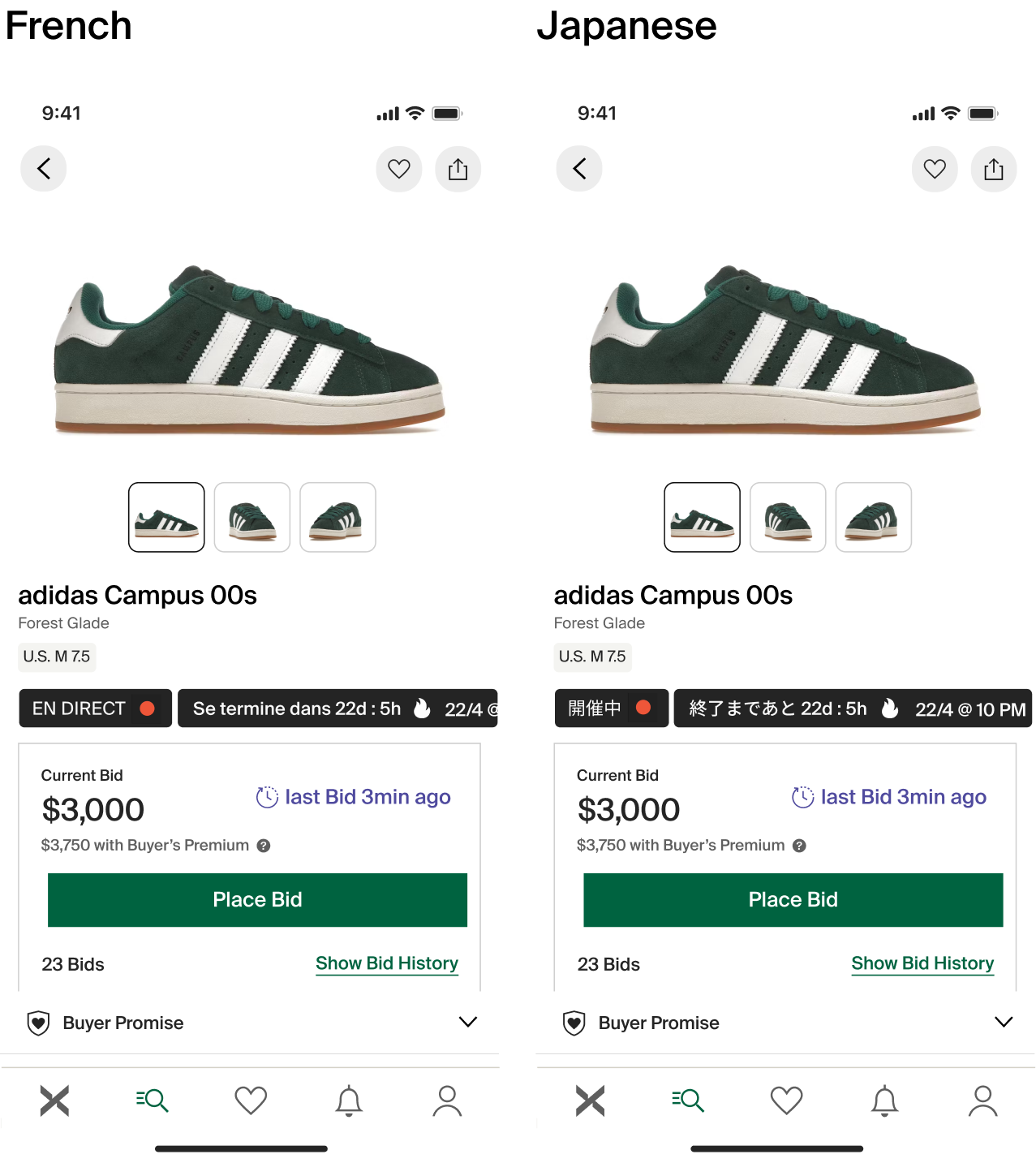
We also tested in multiple languages for fit.
Parts of an Auction
BEFORE
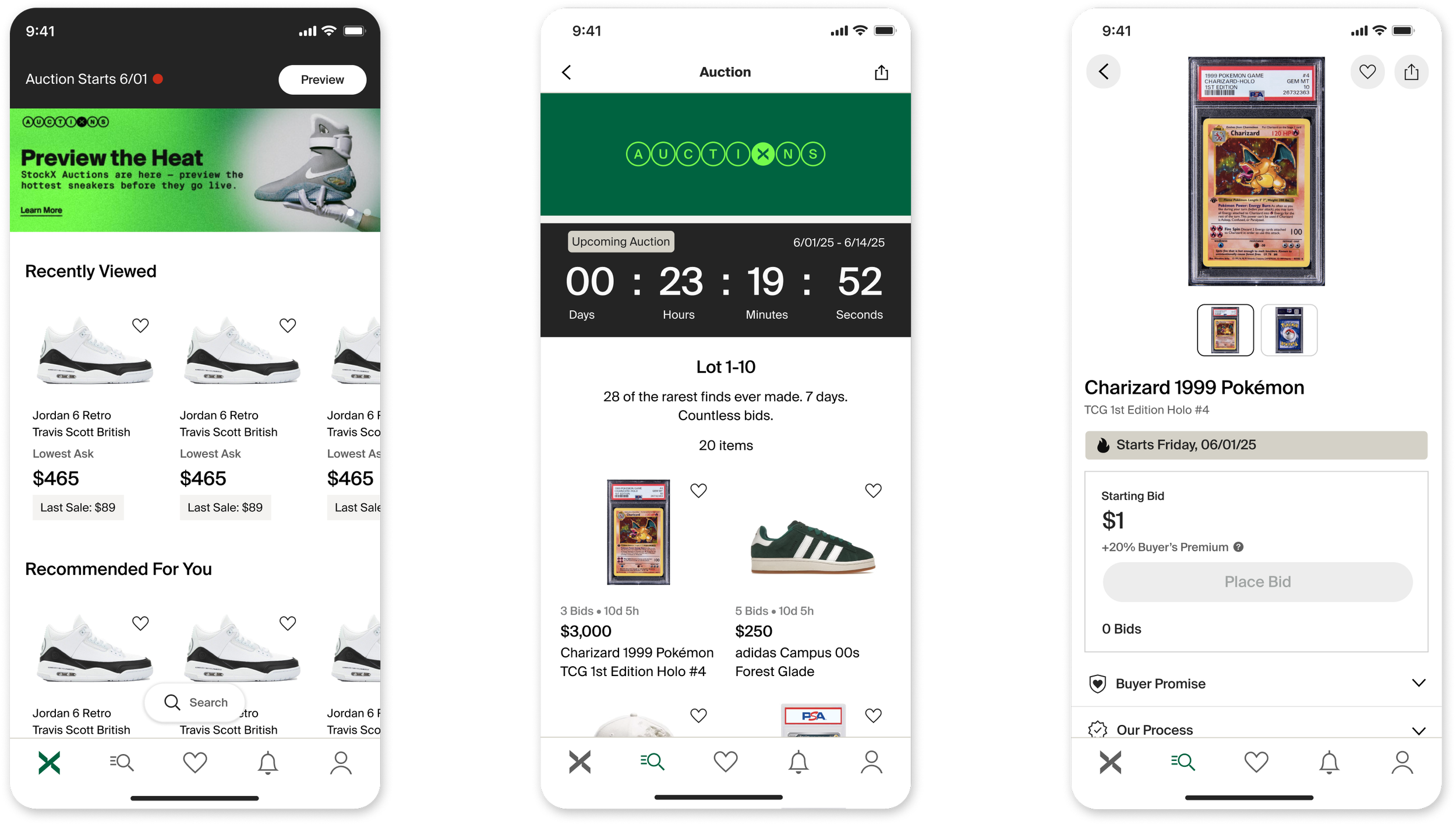
DURING
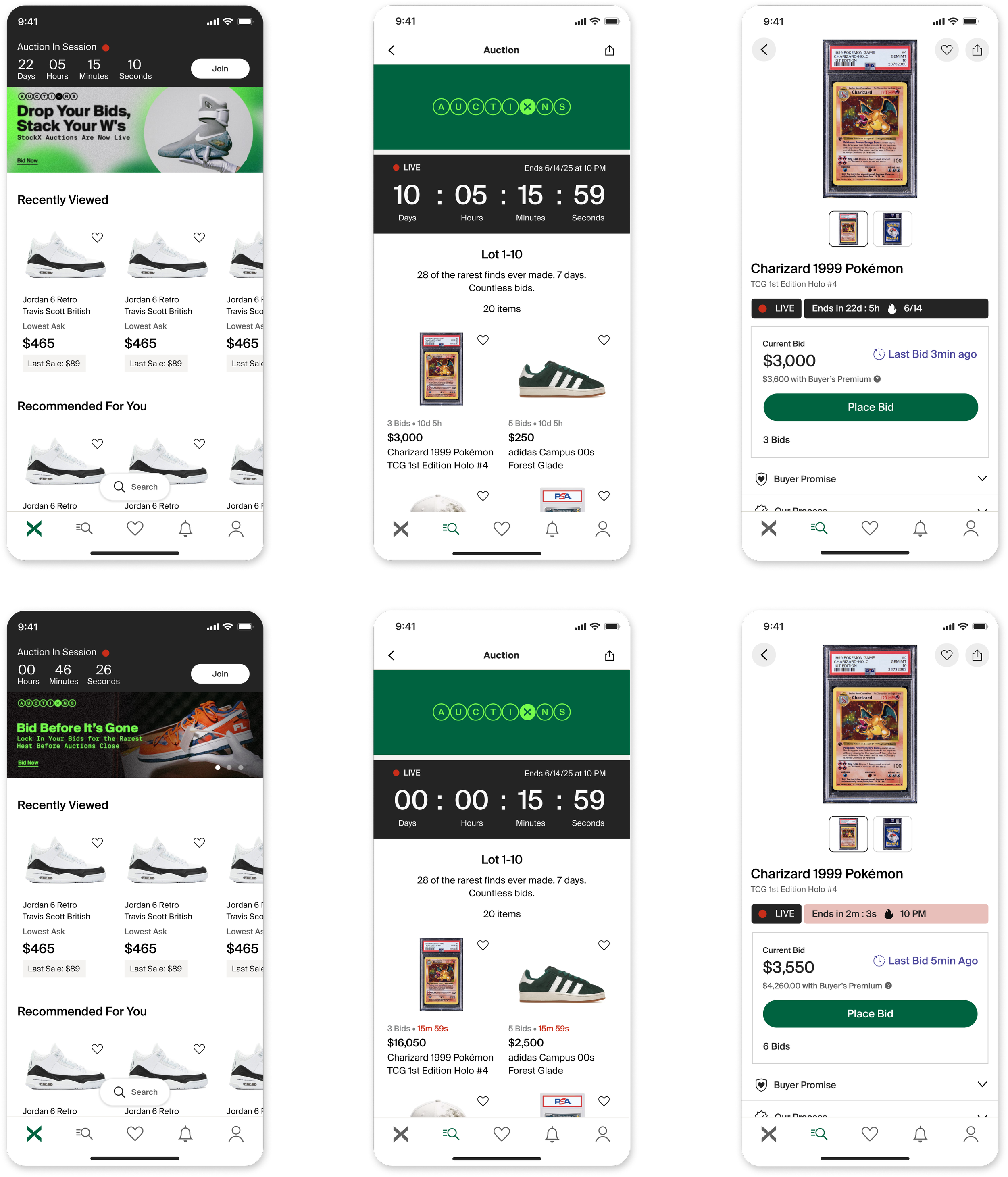
AFTER
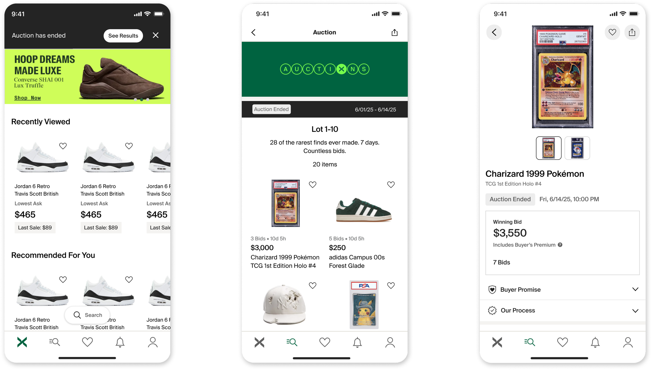
User Research
We conducted a user study with a goal to understand if the design of StockX Auctions caused confusion with the core experience, especially around bidding.
Learnings
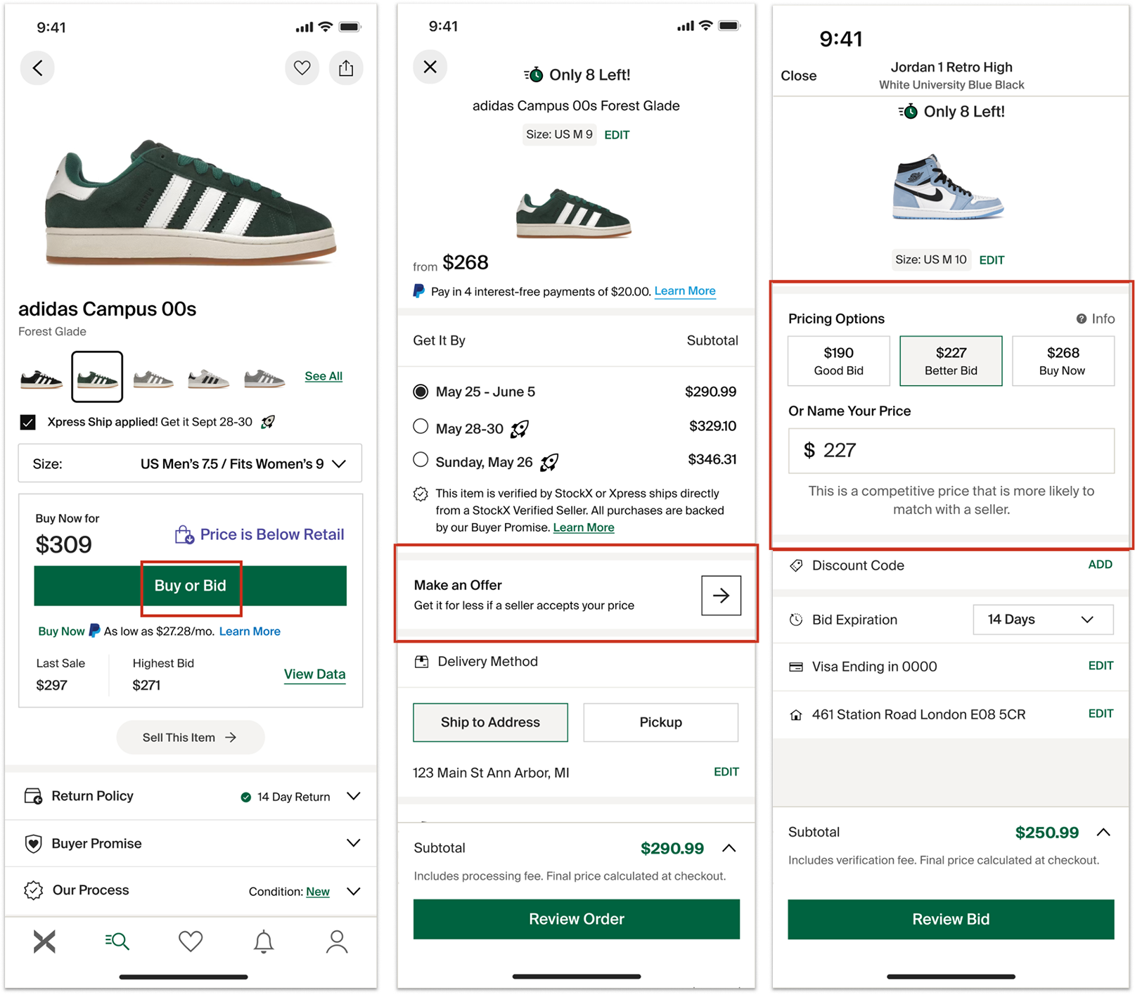
Some users were confused by the main CTA ‘Place Bid’ because it means different things between the PDPs.
On bid entry, ‘Maximum Bid’ was intuitive as a limit, but they wanted more insight into what the bidding increments were.
Buyer’s Premium caused negative reactions. A likely barrier for shoppers with no formal auction experience.
Delight with a Touch of Life

Auctions are inherently lively, and I wanted to bring that energy to life throughout the user journey. As our design team began exploring ways to introduce more motion into our design system, this project offered an exciting opportunity to push our foundations further.
Using Rive, I created movement throughout the experience to add energy and bring the auction experience to life.
These animations were designed for the winner screens. I wanted to introduce subtle movement in the background so the experience still felt alive after the confetti settled. The original concept featured a blurred version of the winning product, with a moving light source glowing through it. However, the dynamic nature of the concept made it a significant engineering lift, so we landed on a more flexible version that could work across all winner screens.
The confetti is especially fun to look back on. When I created it, Rive’s AI agents hadn’t been released yet, so I built the animation particle by particle. Today, confetti animations can be generated and customized with a single click, adjusting speed, density, and color in seconds.
Results & Takeaways
The first signature high-end auction at StockX ran from Nov 5th to Nov 13th, 2025. Featuring 28 hand-selected sneakers. Bidding started at $1 with no reserve, creating a demand-driven marketplace.
The launch of auctions was a success and set up a solid foundation to expand into new business lines. It led to a quick pivot of the roadmap for the entire company.