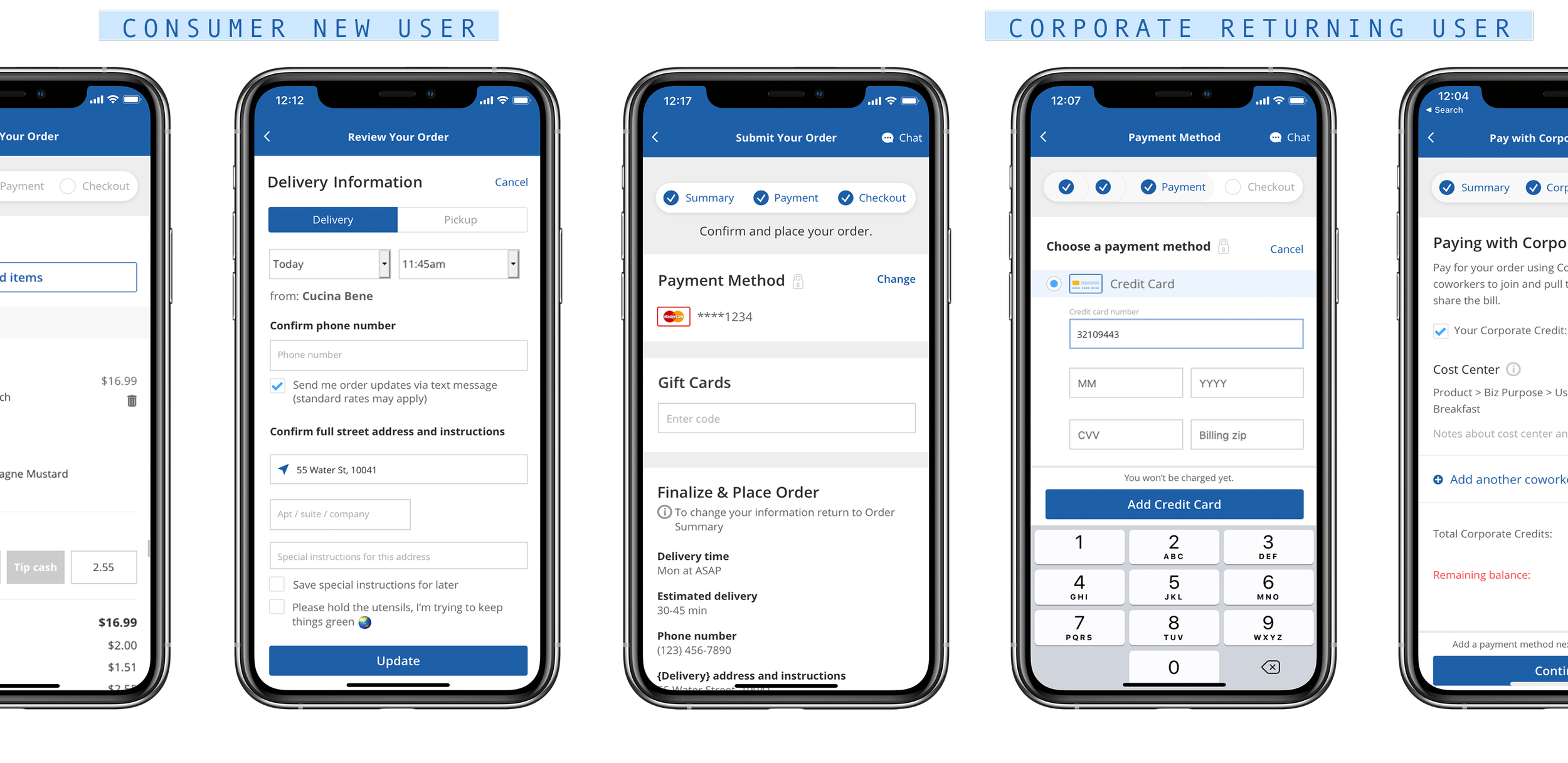
Checkout Redesign
E-commerce demands change year after year. As we grew, the checkout page became cluttered and full of product & tech debt. Through usability testing, we could see our users’ frustration with the experience and the unnecessary length of time spent completing checkout. We reimagined the end-to-end experience to increase conversions and better guide users through each step.
delivery.com | UX/UI Design, User Research | 2018
The Problem
The decline in conversions and user retention, the addition of new features requiring complex checkout states, and expansion into markets with new target users ultimately led to the need for an improved checkout experience.
Goals
Increase conversions across all platforms
Increase load times to decrease user abandonment
Decrease time spent at checkout by empowering user independence
Establish trust and reliability through reduced friction points
Evolve the experience to include a new user base with different behaviors to the core markets
Research
User interviews | User personas | Prototype testing | Customer journey | Market and competitive analysis
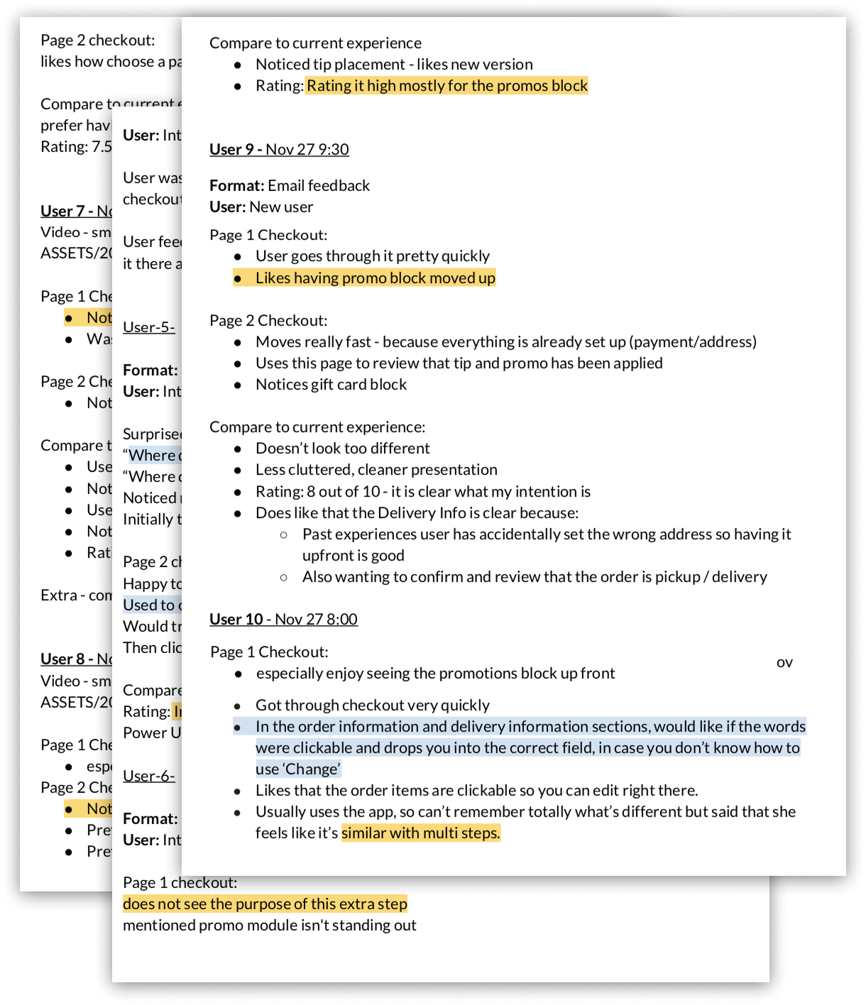
The checkout page had been stuck in time for nearly 8 years when we decided to explore the possibility for improvements. Undertaking such a valuable yet antiquated page and reimagining it required a lot of research and collaboration. Our team started by identifying where our users were dropping off and examining pain points throughout the experience.
Based on user observations, we mocked up wireframes and conducted user testing in which we continued to iterate through and post launch. We structured the sections in order of importance based on user analysis and balanced with business prioritization.
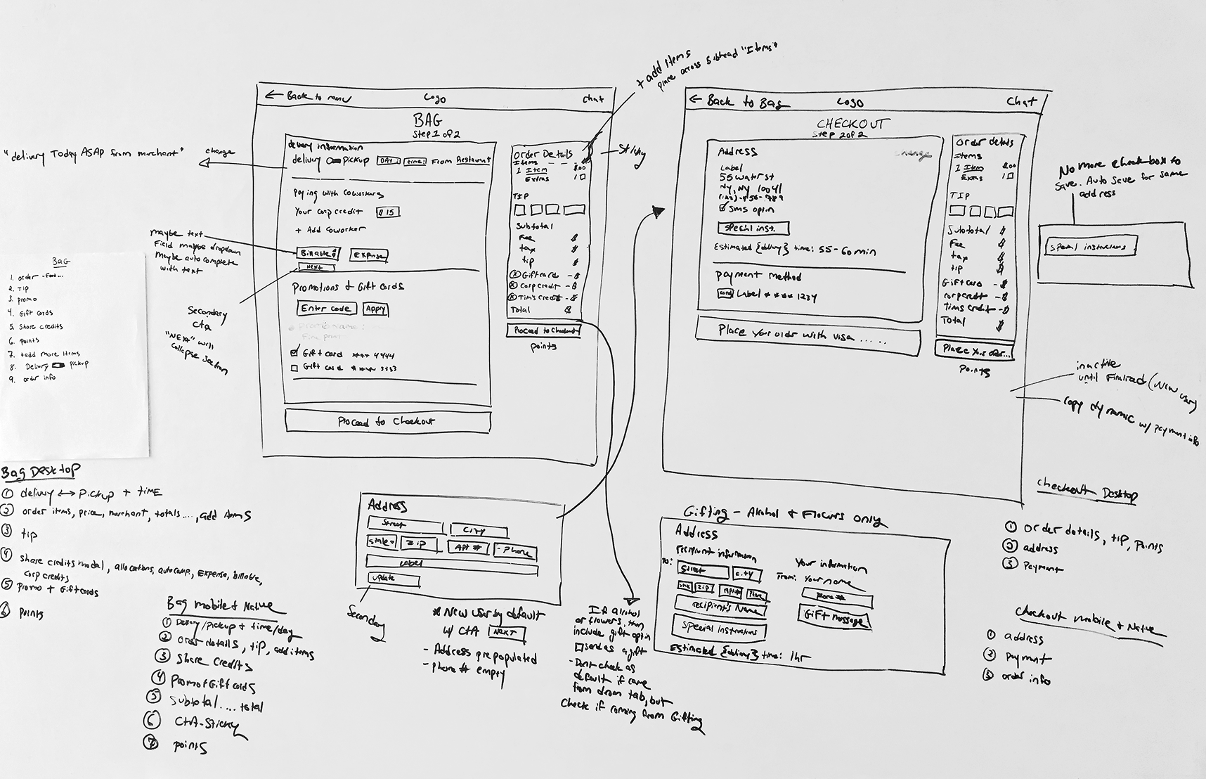
Exploration
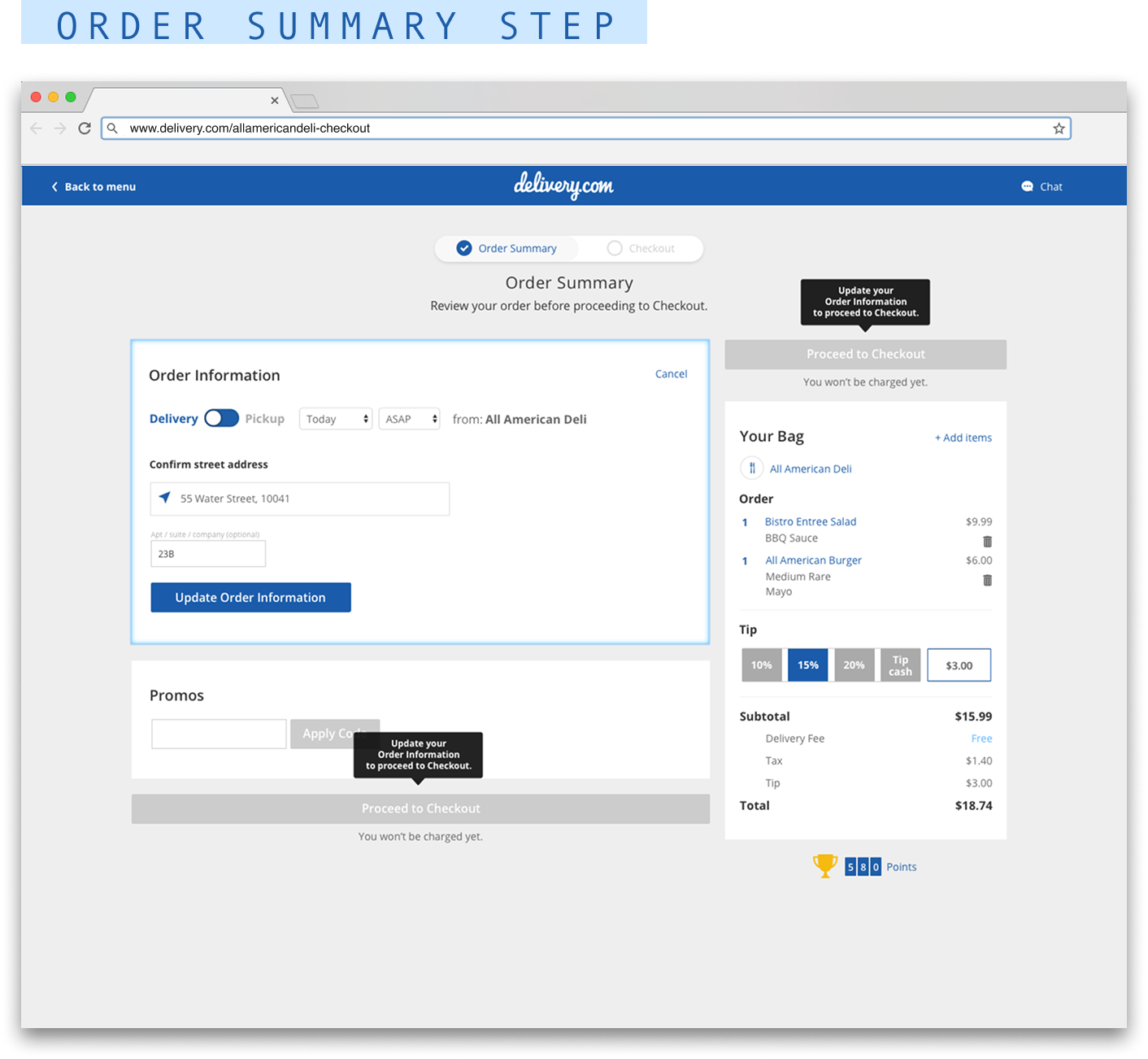
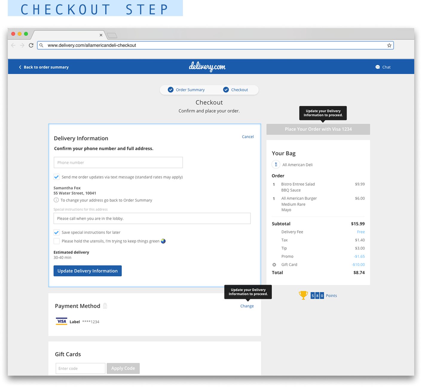
To help ease the overwhelming sense of confusion that users faced, we took a more compartmentalized and guided journey approach. We added an Order Summary page, to shorten the content per page and provide them a place to edit orders, preventing high friction points on the Checkout page.
Using a series of UI, copy and animation elements, we have empowered users to digest each step of the experience quickly and smoothly.
Iteration
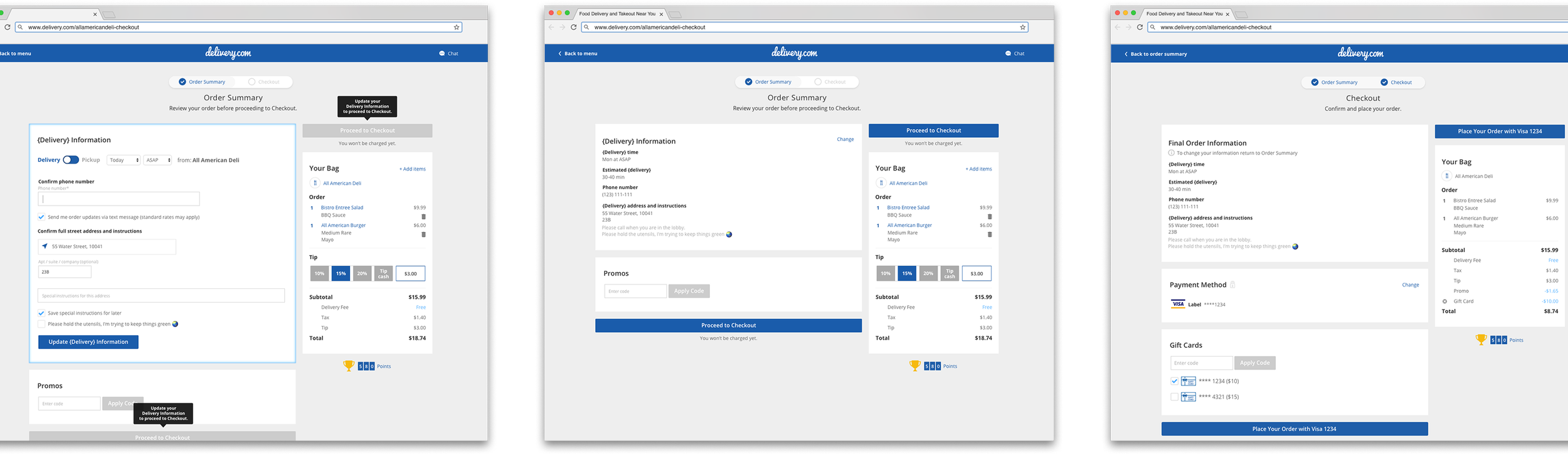
After the full rollout, we observed user behavior, focusing specifically on the Order Information and Delivery Information sections. We learned valuable feedback about the way users were interacting with their address and that they were looking for better visibility into their pickup orders at Checkout. This led us to reorganize some of our sections and fine tune edge case flows.
Mobile Specific
We onboarded 20+ new markets almost overnight and suddenly saw an influx of users we were not fully informed on. We learned that over 60% of users in these markets were using mobile devices over desktop, a much higher percentage than in our core markets. With declining mobile conversions, our challenge then was to optimize our checkout experience specifically tailored to mobile.