Merchant Discovery
delivery.com | UX/UI Design, User Research | 2017-2020
The Problem
Users are having a hard time finding relevant restaurants.
Goals
Decrease time spent searching for restaurants
Establish trust through improved personalization
Improve discoverability through an image-rich experience
Overview & Research
The vertical discovery pages were a key part of the user journey on delivery.com, serving as a primary destination for discovering merchants. We spent multiple years exploring iterations of the Food discovery tab to improve discoverability and help users navigate choice paralysis.
To better understand how and why users chose a merchant, we conducted a series of user tests focused on their ordering habits and decision-making process. We identified five key factors that influenced their choices: reviews, distance, estimated delivery time, order minimums, and delivery fees. These insights helped us prioritize the most relevant information and make it easier for users to compare options and decide where to order.
User interviews | User surveys | Market and competitive analysis | Prototype testing
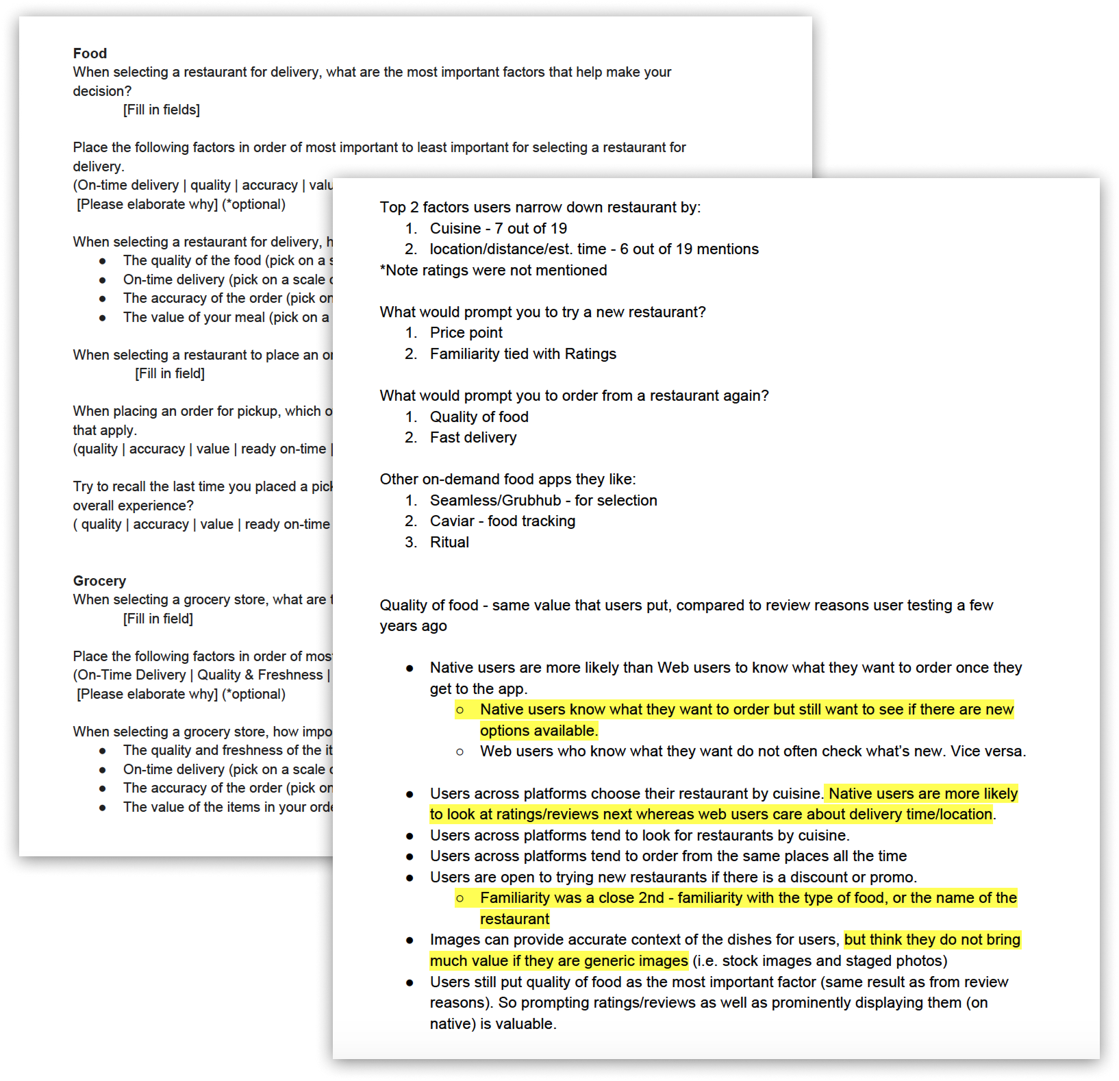
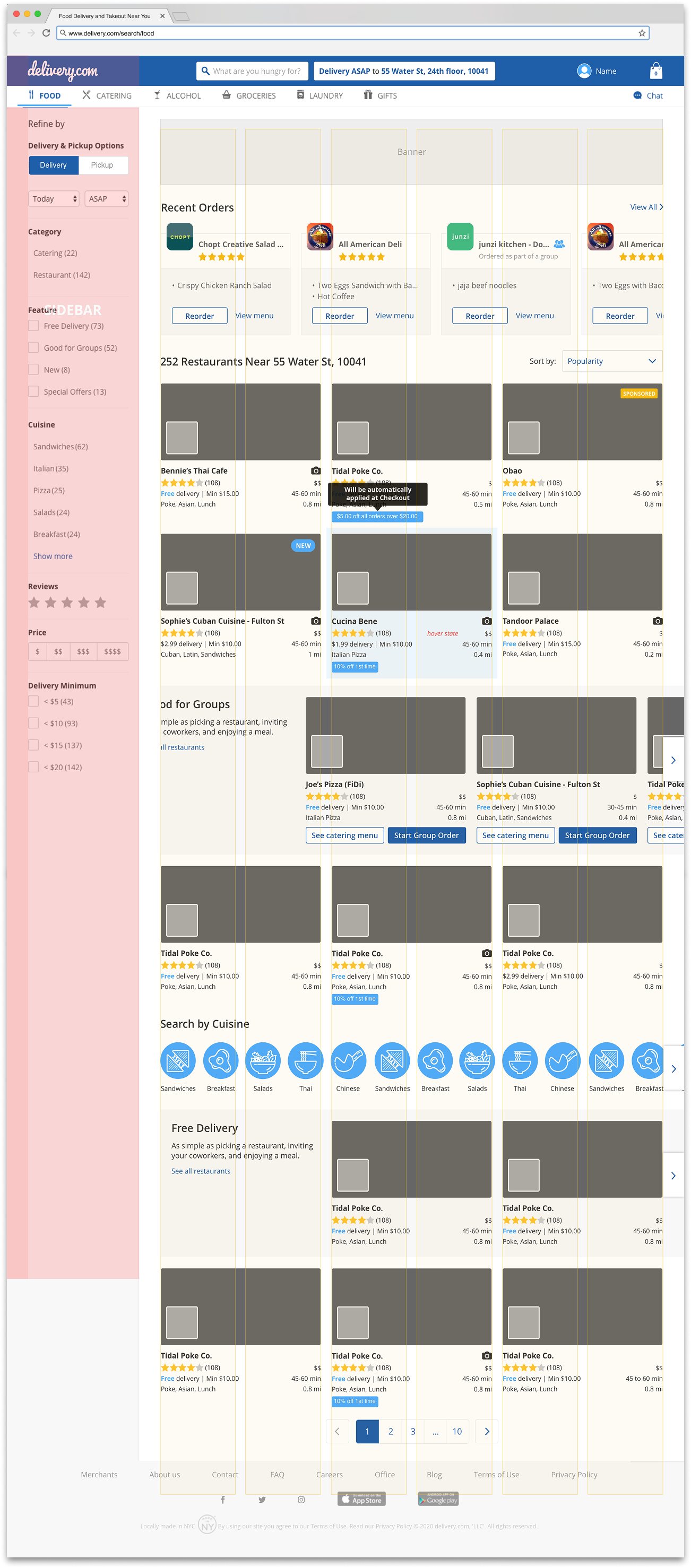
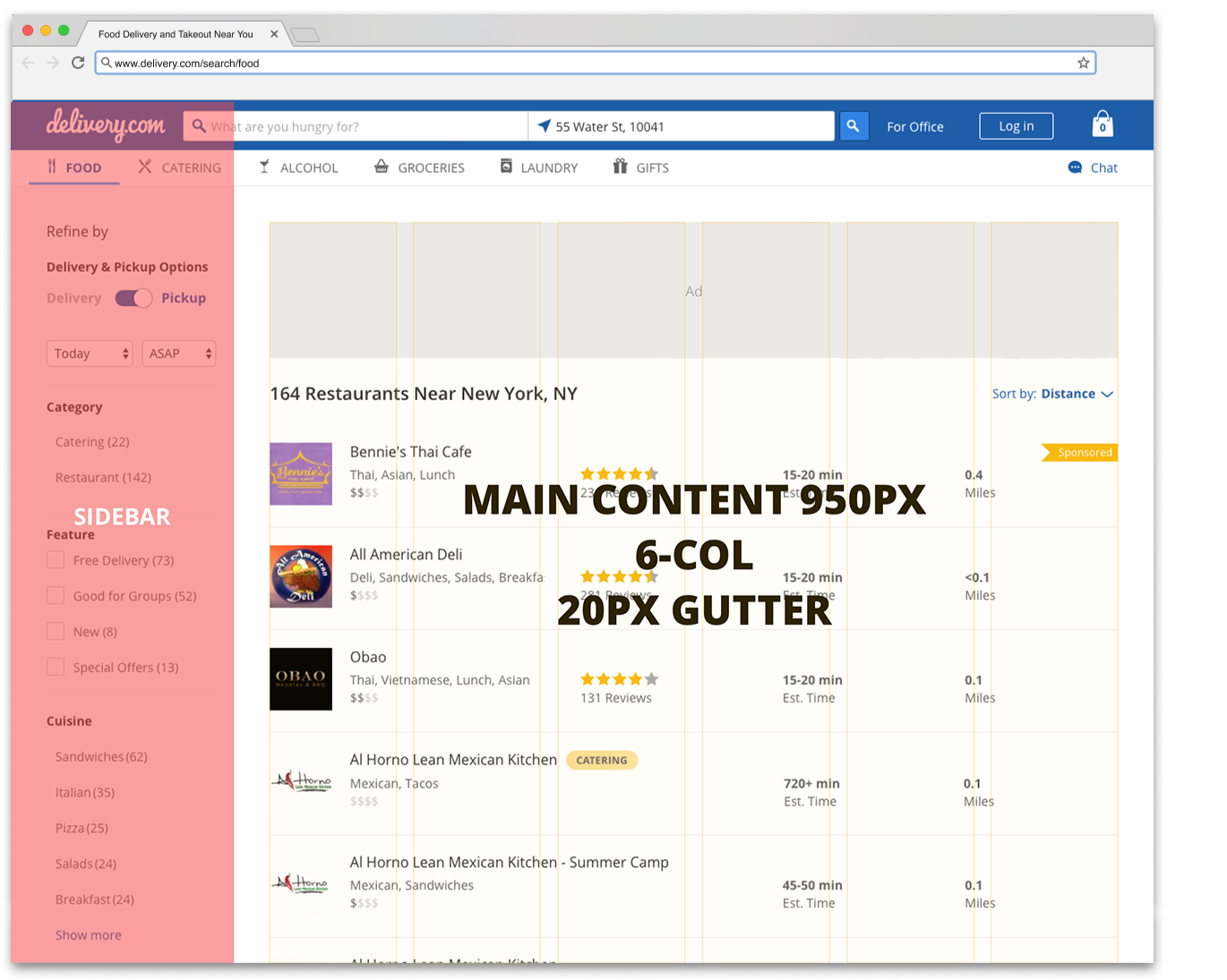
2017 / The Before:
Design
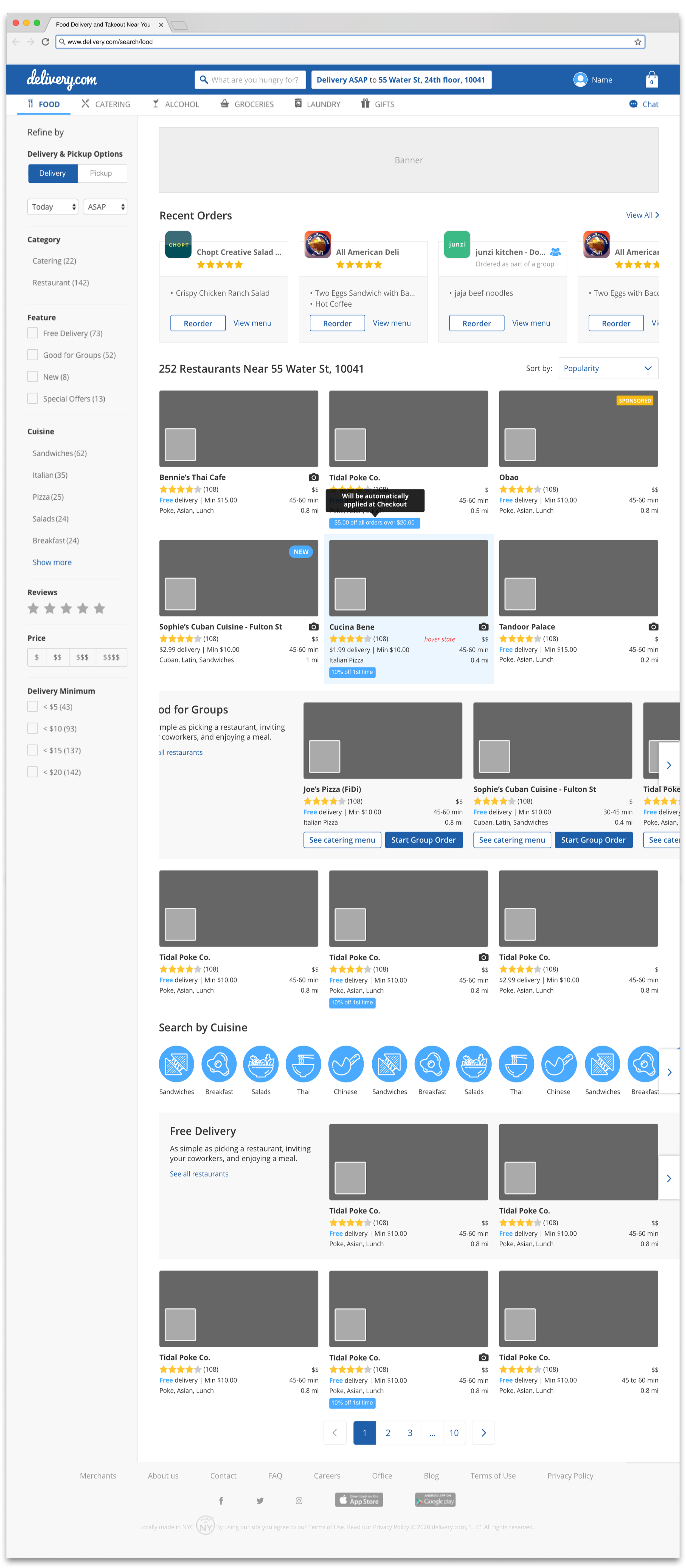
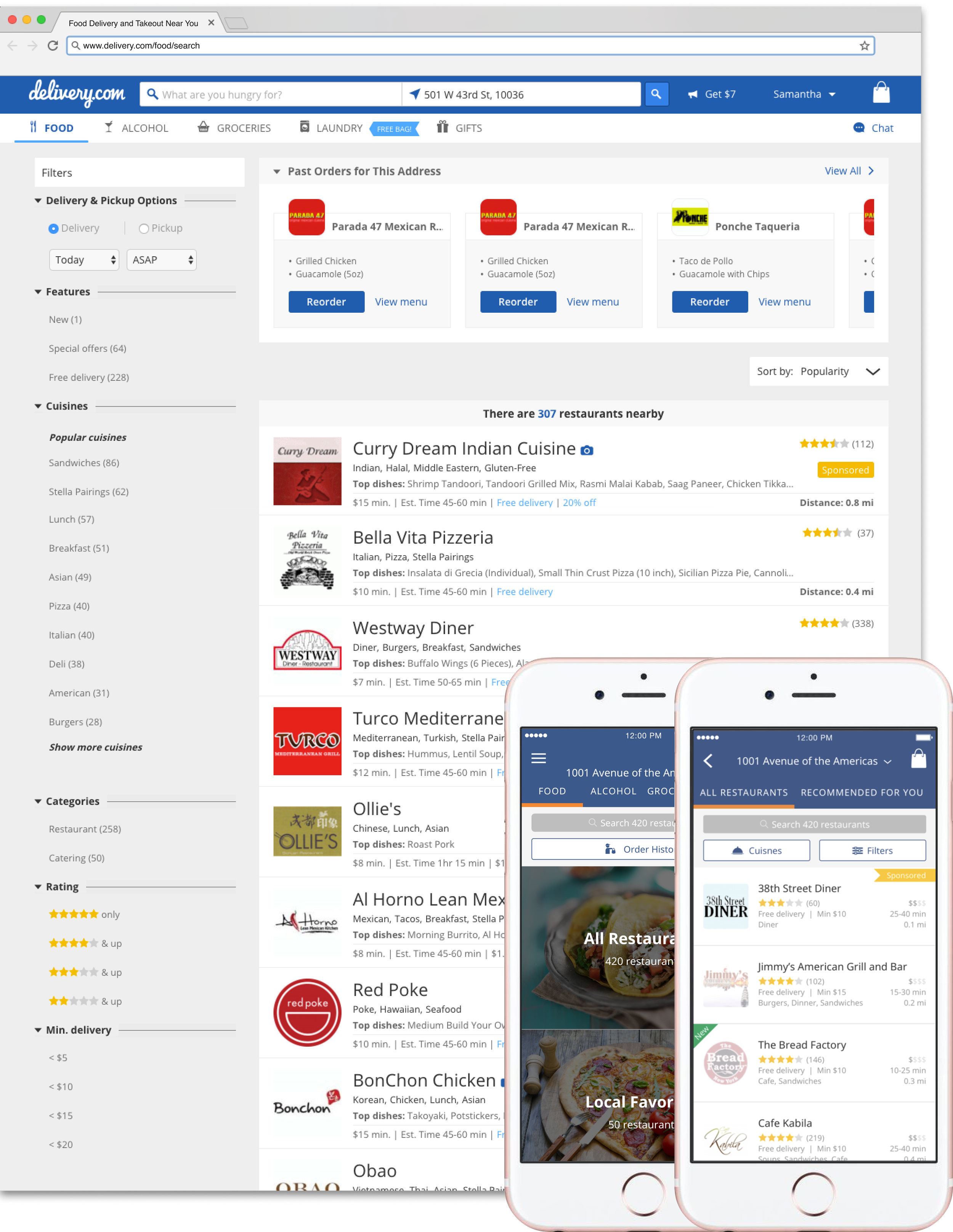
Given the scale of the project, we worked in phases to keep the scope manageable. 2017 to 2018, we used insights from user interviews and surveys to refine content, rethink the information hierarchy, and refresh the layout around users’ needs.
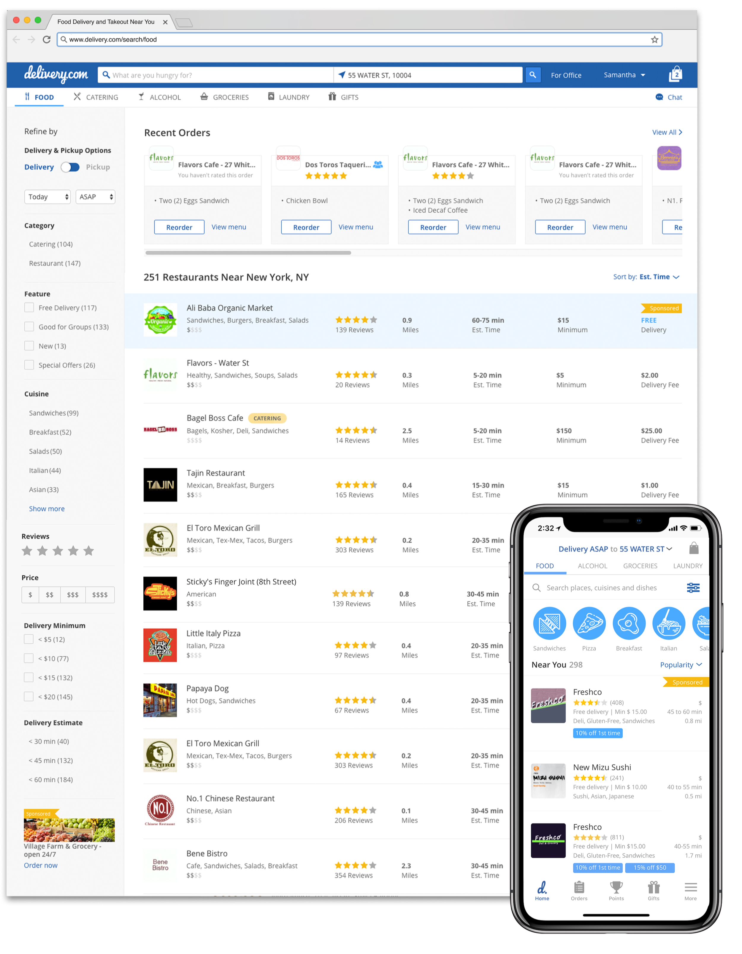
We then focused on filters, bringing all discovery tabs to parity. Engagement data showed that 9.65% of users interacted with a single cuisine filter, while only ~2% used multiple filters simultaneously. Based on these findings, we simplified the cuisine filter to a single-select experience, allowing users to search one cuisine at a time while reducing technical complexity.
2018 / Phase 1:
Research Phase 2
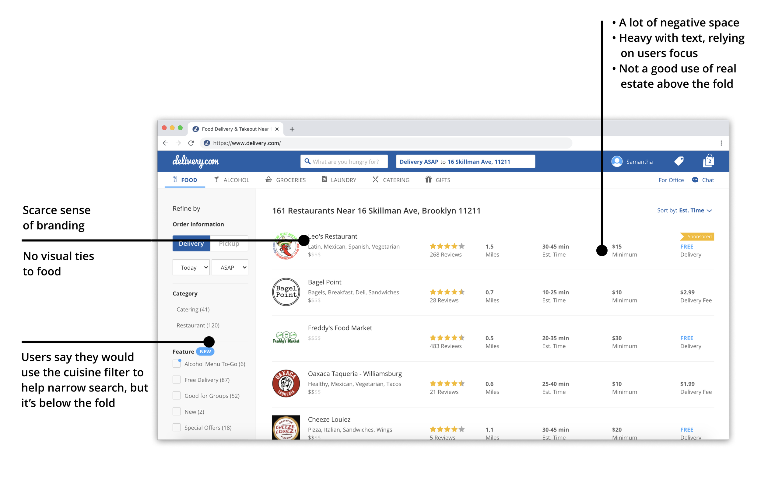
We conducted another round of user testing with the existing design to learn about any shortcomings.
Iteration
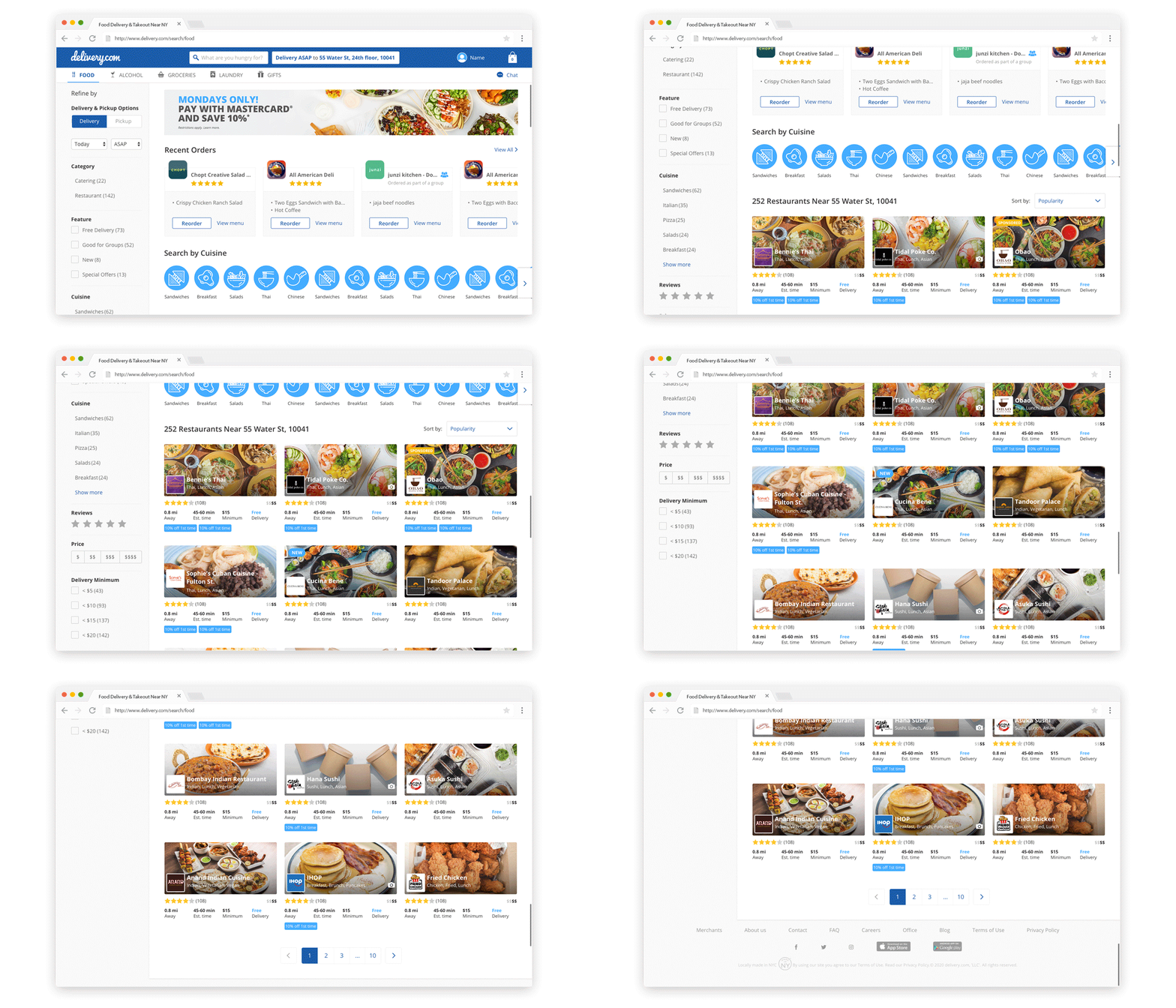
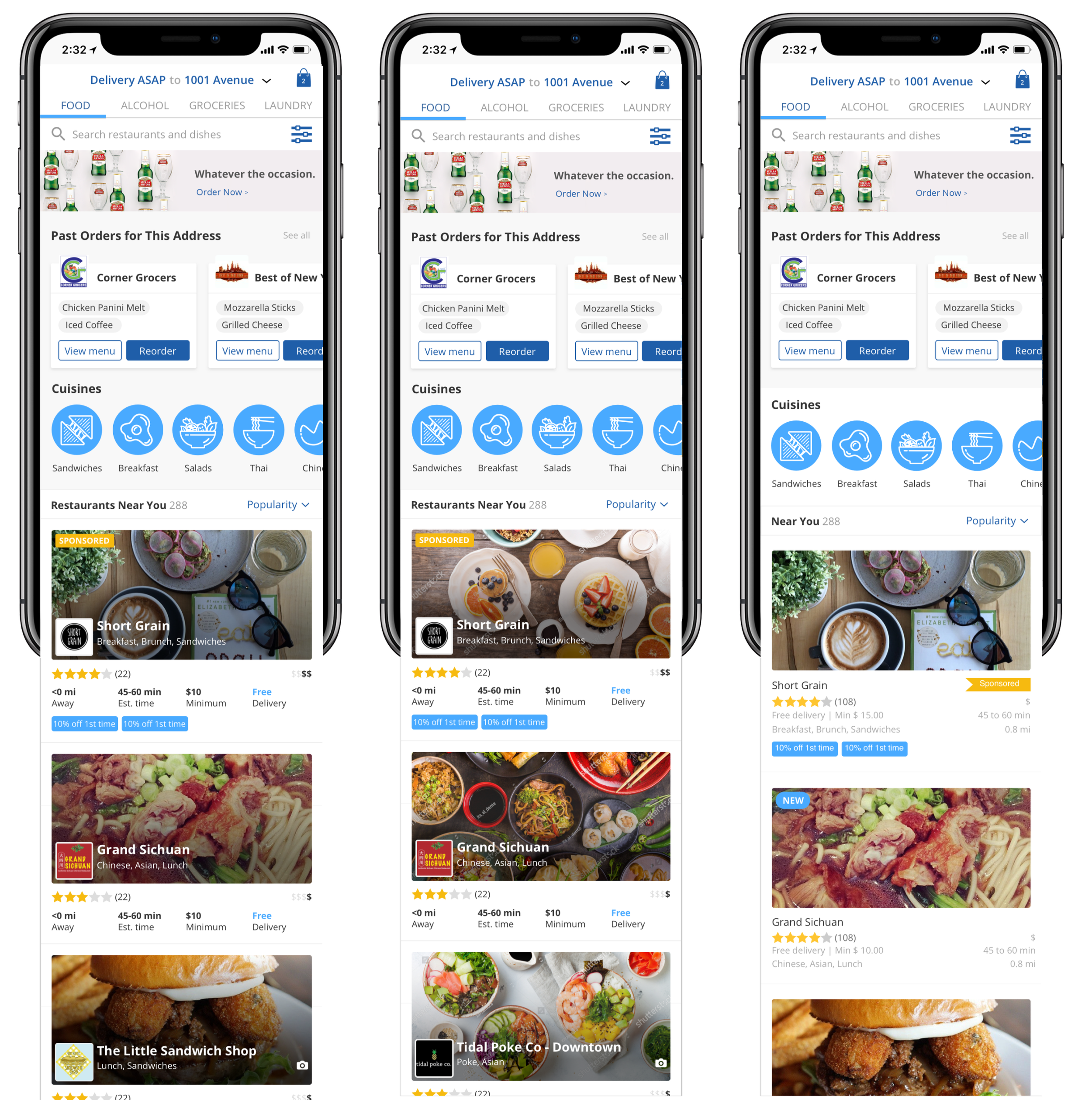
As the competitive landscape evolved, we revisited Phase 2 of the discovery experience. Users increasingly expected more visual, immersive experiences, and competitors were leveraging restaurant imagery to drive engagement.
Previous technical and product limitations had prevented us from prioritizing imagery across merchant tiles. With a stronger foundation in 2019–2020, we were finally able to explore this as a way to better serve users.
We reimagined the layout with a modernized grid of tiles rather than stacked rows, improving scannability while continuing to refine the information hierarchy. We also introduced interstitial carousels as another concept to test.
2019 - 2020 / Phase 2: